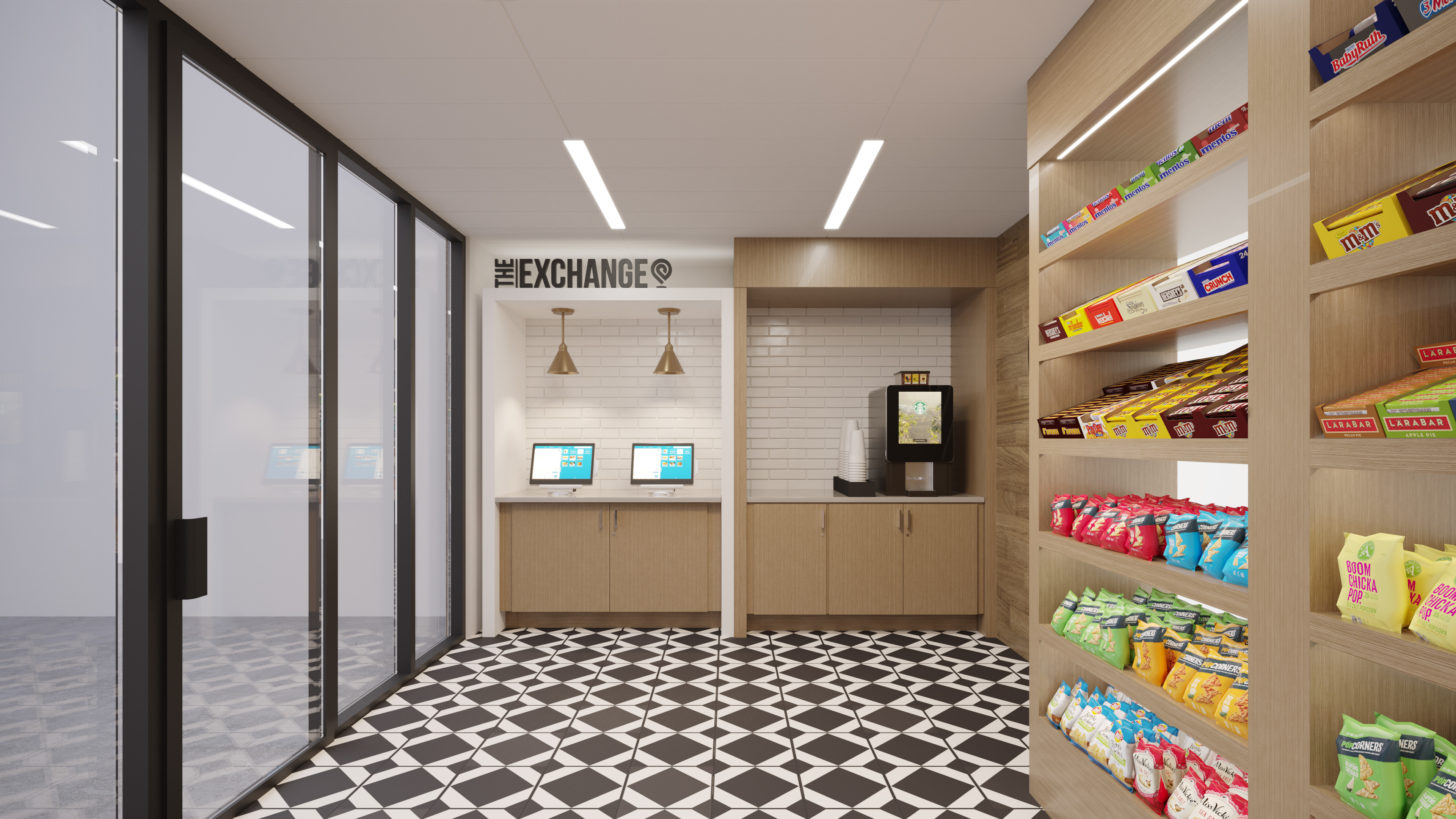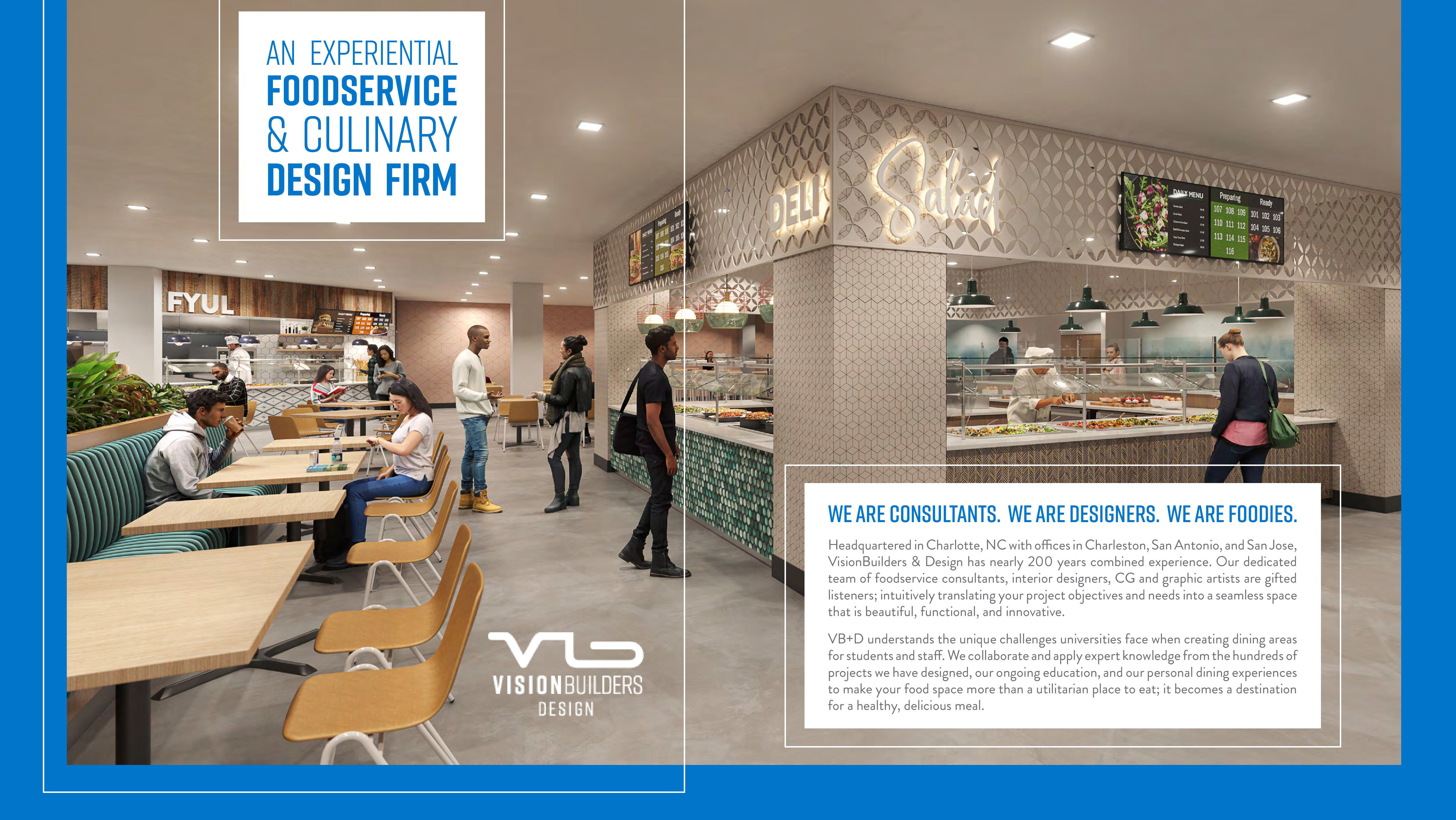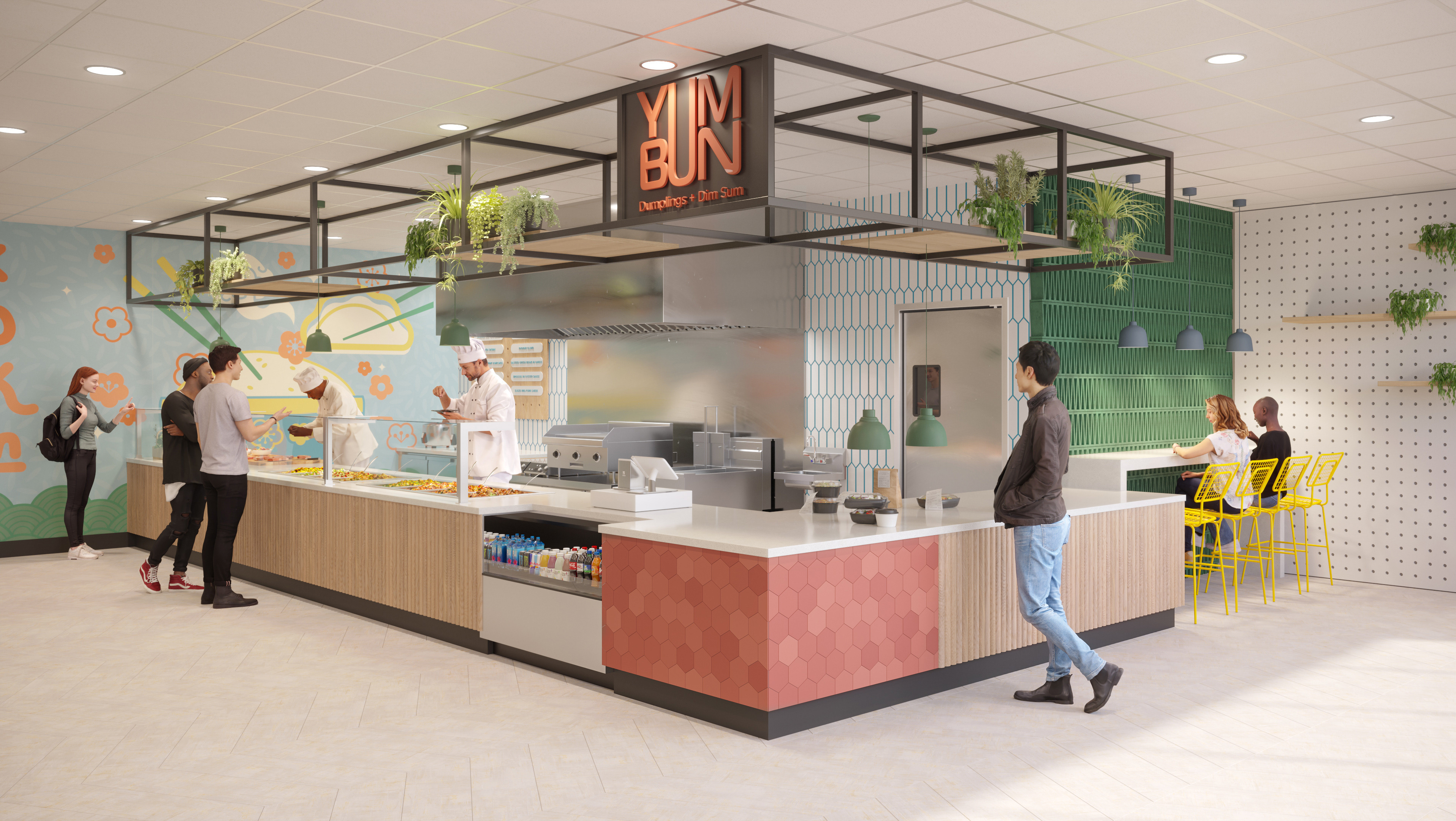
I worked alongside the Lead Interior Designer to develop the name and logo for The Exchange Market which will be incorporated in 3 different sizes across Universities, Corporate Facilities, and Hospitals. The modern, black and white aesthetic with warm wood tones was the base of the inspiration board. I developed a list of names and The Exchange was selected. I selected the font and logo icon to strengthen the brand being a quick stop, grab-and-go style market that was modern with technology ordering and payment at the forefront. Lastly, I assisted in verifying the print files were ready for production. Wall graphics, millwork wood plank prints, and white subway tile were adjusted for the printing team to be seamless and high quality.